In the ever-evolving ecosystem of UI design, two giants stand face to face: Google’s Material Design and Apple’s newly unveiled Liquid Glass. A clash of titans, like Kong and Godzilla, these systems not only define the visual language of their ecosystems but shape the behavior and expectations of users across billions of devices. As Milton Glaser might have asked, “Does it inform and delight?” And Dieter Rams would insist, “Is it good design?”
Origins and Philosophy
Material Design, born in 2014 under Google’s vision, aimed to bridge digital and physical realities. It brought order to chaos through grids, shadows, elevation, and motion—elements that mimicked real-world interactions in a digital space. In Rams’ language: it was honest, unobtrusive, and thorough down to the last detail.
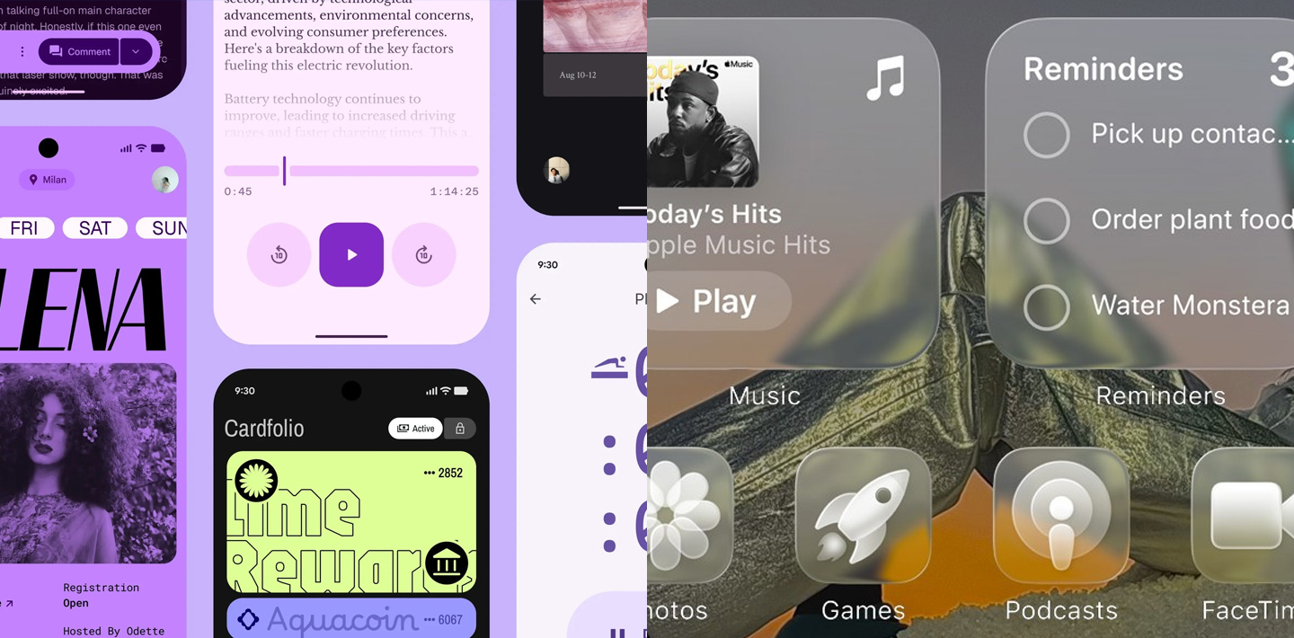
Liquid Glass, Apple’s 2025 design revolution, is rooted in elegance and responsiveness. Inspired by real glass, it brings depth not through shadow but through light, reflection, and motion. In the tradition of Apple, it strives to be intuitive, sensual, and context-aware—a true sensorial experience.
Visual Language and Depth
Material Design uses surfaces, layers, and shadows to create a structured visual hierarchy. Its language is logical, ordered, and clean. It’s the Swiss Grid meets Bauhaus functionalism—a world where every pixel is accountable.
Liquid Glass, on the other hand, embraces organic light play. It’s not about separation but immersion. Glass layers reflect, react, and respond, making the interface feel alive. Glaser would smile at its ambition to delight and surprise without excess.
Platform Philosophy
Material Design is open, flexible, and modular—used across Android, the web, and even iOS. It champions accessibility and scalability. It’s the internationalist: a toolbox for all.
Liquid Glass is distinctly Apple. Tailored to their ecosystem, it leverages the deep hardware-software synergy of the brand. It feels less like a design system and more like a curated experience. Rams might question its universality, but admire its precision.
Usability and Emotional Connection
Material Design encourages predictability. It fosters clarity and usability. Its rhythm is dependable, its tone neutral. Think Helvetica.
Liquid Glass appeals emotionally. It wants users to feel—to glide, discover, experience. It’s a design that lives and breathes with the user. Think sensorial storytelling with San Francisco font.
Final Thoughts
If Material Design is about guidance and structure, Liquid Glass is about immersion and emotion. One informs, the other seduces.
Like Kong and Godzilla, neither is inherently superior. Each dominates its territory with power and personality. And when they meet in the hands of a skilled designer, they don’t clash—they inspire.
At GAS Agency, we believe in mastering both. Because the future of design isn’t choosing sides. It’s knowing when to roar like Godzilla, and when to dance like Kong.
| Feature | Material Design (Google) | Liquid Glass (Apple) |
|---|---|---|
| Conceptual inspiration | Digital paper and physical objects | Real glass with optical properties |
| Use of depth | Shadows, elevations, and purposeful animation | Transparency, reflections, and refractions |
| Platform support | Android, Web, iOS, multiplatform | iOS, iPadOS, macOS, watchOS, tvOS |
| Main goal | Coherent, consistent, and user-friendly UI | Immersive, elegant, and context-aware visual UX |
| Evolution | Now at its most expressive phase with MD3 | Brand new design paradigm announced in 2025 |